Crafting a "native like" Responsive Website with Django and HTMX

Introduction
Most of the time I’m paid to work as a Data Engineer / Architect working with Scala and Python, but I started my career as a Software Engineer and sometimes I feel the itch to build products (they often are data related). I have a deep interest around RSS and the way it can make us avoid using social network.
Last time I built a product I did it with Vuejs for the frontend and Vertx backend. But few weeks ago I wanted to explore a new project (for context it’s a continuous learning software built on top of an rss aggregator) and wanted to start working on it. But I was feeling exhausted even before starting to work with Vuejs again because I had some problems around states bugs and hard to replicate issues.
I don’t know how but I started to explore the alternatives and discovered HTMX, it felt a bit like the old school patterns I used on the first WebApp I built nearly 10 years ago using Django and JQuery.
The goal of this post is to explain what I’ve done with HTMX, if it works and if it was a good idea.
The project
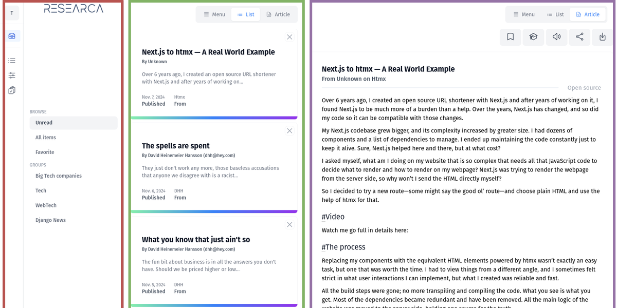
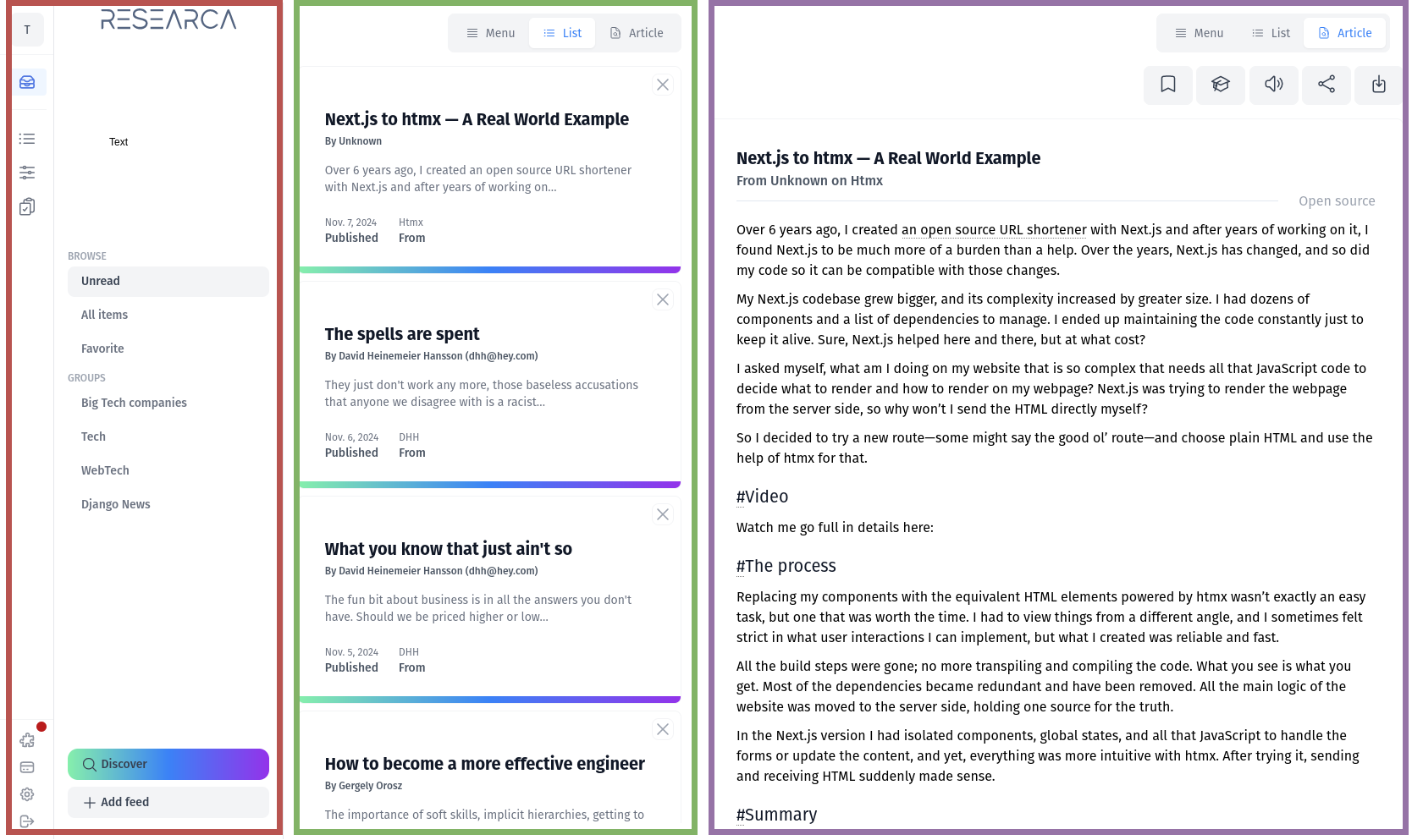
So the scope of the web app was well defined I wanted to have 3 panels on with a menu that can be complex, another one with a list holding my infinite scroll of items to read and the last panel to display the details of the selected element in the second panel.
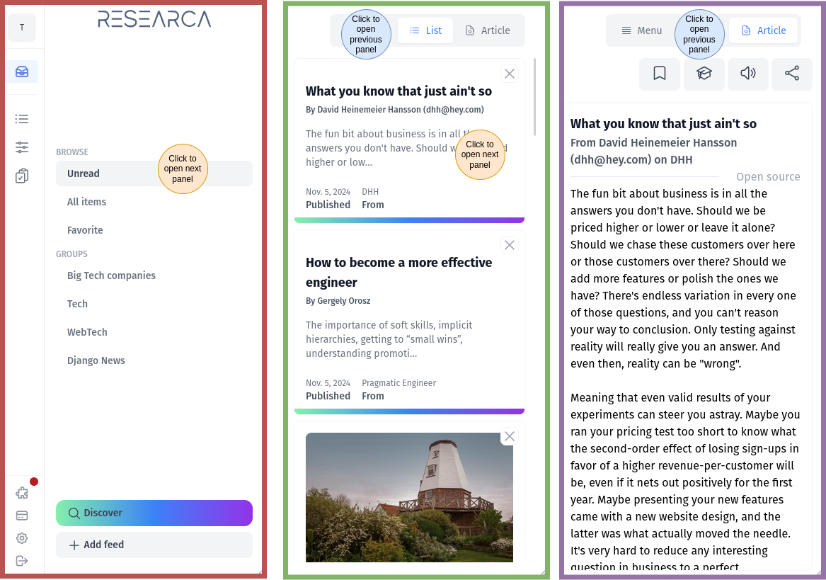
All good but my challenge was that my WebApp needed to have a very good mobile support and something like the 3 panel should becomes 3 tabs on mobile devices. Responsive design is perfect for this change of layout but the behaviour is the real challenge.


So my stack would be:
- Django in the backend, it has a lot of features, easy to use, and I have a bit of experience with it…
- Vanilla JS for the few functions I will have to develop.
- Tailwind, because it’s okayish, no strong opinion about it.
- HTMX for the interactions with the backend, I knew some features I needed and I checked before if it was possible to:
- Infinte scroll
- Send events on reveal
- Nested event that should not be propagated (it's just js)
Implementation
Design
Using Tailwind I could design the responsiveness of the website quite easily but that's not the important point. Just note that even if I only spoke about smartphones and desktop I also decided to handle medium sized device because I often work with splitted browser windows.
Tabs
The tabs would have to behave a bit differently between mobile and tablet design but it was fairly simple to make it work even in vanilla js.
const breakpoints = {
    one_panel : 768, #smartphones devices
    two_panels : 1024, #tablet like devices
};

const menu_panel = document.getElementById('panel_menu');
const center_panel = document.getElementById('panel_list');
const article_panel = document.getElementById('panel_details');
panel_menu is the div containing what’s in the red square, panel_list is the green one and panel_details is the purple.
I also created 2 small functions to hide / display div
function display_panel(panel) {
    panel.classList.remove("hidden");
    panel.classList.add("block");
    panel.classList.add("md:block");
}

function hide_panel(panel) {
    panel.classList.add("hidden");
    panel.classList.remove("block");
    panel.classList.remove("md:block");
}
Then most of the behaviour to switch from the different tabs / panels is simply defined in this few lines of codes
function switch_to_center_panel(clicked_item) {
    change_selected_element(clicked_item) // update menu clicked
    if (window.innerWidth <= breakpoints.one_panel) {
        hide_panel(menu_panel);
        hide_panel(article_panel);
        display_panel(center_panel);
    }
    if (window.innerWidth >= breakpoints.one_panel
			    && window.innerWidth <= breakpoints.two_panels) {
        hide_panel(article_panel);
        display_panel(center_panel);
    }
}
The code simply hides the other panels and display the panel you should see based on the item you clicked and that’s it. I built 3 functions like that, one for every panel the only change is the panel hidden and the panel or panels displayed.
This will handle the navigation but not the refresh of the data, where htmx starts to shine.
HTMX
Using Django I used templates and that’s cool because it makes reusing components very easy, exactly what I want to do with htmx.

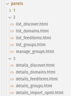
I decided to split my templates based on where they will sit on my layout. It makes it easier to find the component you need to update.
And my HTMX route with only be something like that:
# urls.py - Example of URL used
path('htmx/feed_item/<int:pk>',
        view=FeedItem.as_view(), name="htmx_feeditem"),

# views.py - FeedItem get method
def get(self, request, pk, format=None):
		# ORM work to get the data I want to display
    ufi = (
        UserFeedItem.objects
        .filter(user = request.user)
        .filter(id = pk)
    )[0]
    return render(request, 'panels/3/details_feeditems.html', {
        "feed_item": ufi
    })
Example of urls & view declaration in Django
Using this pattern I can simply resend the third panel of my layout and replace it.
<div class="relative block overflow-hidden rounded-lg border border-gray-100 p-4 mb-2 sm:p-6 lg:p-8"
        href="#"
        hx-get='{% url "htmx_feeditem" item.id %}'
        hx-trigger="click"
        hx-target="#panel_details"
        hx-swap="innerHTML show:top"
        hx-on::before-request="display_skeleton();switch_to_article_panel();"
>
Example of HTMX settings when clicking on a list item to display the article associated with it
This code ensures that when clicking on any element on the list (center panel) it will get the element it should display found at the route htmx_feeditem as explained in the previous code sample and the result will be displayed in the #panel_details which is the 3rd panel. Once it’s done, the display_skeleton() is called to smooth the transition and switch_to_article_panel() is called to change the selected panel if we’re on a mobile and tablet like device.
In the HTML of the page returned by htmx_feeditem I added this element. That would hide the skeleton once the div has settled.
<div
    id="main"
    hx-on::after-settle="hide_skeleton()"
>
Example of triggering hide_skeleton method after the layout has settled
Whereas on a page full load like for the first run of my application my template contains something like that:
<!-- menu-->
<div
    id="panel_menu"
    class="block col-span-10 md:col-span-3 lg:col-span-2">
    <div class="flex">
        {% include "panels/1/menu_micro.html" %}
        {% include "panels/1/menu_large.html" %}
    </div>
</div>
<!-- list-->
<div
    id="panel_list"
    class="block col-span-10 hidden md:block md:col-span-7 lg:col-span-3">
      {% include "panels/2/list_feeditems.html" %}
</div>
<!-- details -->
<div
    id="panel_details"
    class="block col-span-10 hidden lg:block md:col-span-7 lg:col-span-5">
      {% include "panels/3/details_feeditems.html" %}
</div>
As you can see we just reuse the “panels/3/details_feeditems.html” exactly the same template used in the HTMX route.
Using this pattern, the frontend code gets really simplified because I always reuse the same component and once the JS code is written it just works and complexity doesn’t increase even if add some new pages.
Issues & solution
I faced 2 issues when working on this project:
The scope of HTMX
The first issue I faced was finding the balance between all the things are done in HTMX and none are done using HTMX, I found the app behaviour to be more easy to handle and less prone to complexity if
- Panel 1 (Menu): Static links, no HTMX.
- Panel 2 (List): HTMX for dynamic updates with infinite scroll.
- Panel 3 (Details): HTMX to load details on selection.
- The thinking process was that the left part of the WebApp will be the less used, most of the user will spend time in panel 2 and panel 3 so no need to have a very dynamic behaviour in the left panel.
Back button and history management
The second issue is that being able to use the back button makes the app feel a lot better on mobile so it was important to make it work to have a more “native” feel.
- This can be done using the hx-push-url.
hx-push-url=true
- It works well on desktop but has 2 issues, first if I reload the page based on this URL I will only have the last HTMX component updated, so I need to force another URL and on mobile I will probably have to add an additional parameter to select the good panel. So something like this should do the trick.
hx-push-url='{% url "htmx_feeditem" item.id %}#panel_3'
Be careful, when working with history you may start facing issues about the dom getting saved in a state you didn't want if you display a skeleton while waiting for the page to load. The solution I found was to catch the historyRestore event and fix this invalid saved state in a small function.
See https://github.com/bigskysoftware/htmx/issues/1015 for more examples.
CSRF
Another issue I got was around the CSRF security in Django but the solution was widely available on the internet, it was just to push the CSRF token in the header of the HTMX query.
hx-headers='{"X-CSRFToken": "{{ csrf_token }}"}'
Video
Demo video of the app
In the first part of the video (beginning to 00:25) you can see the behaviour of the webapp clicks, back button, skeleton and in the second part you can see the url changing based on the user actions.
You can see on the side the scrollbar moving, as soon as you're near the bottom of the list, new items get fetched to create the infinite scroll.
Conclusion (TLDR)
To be honest I started this project just because I didn’t want to learn a new mobile oriented framework, find the build cycles and the javascript ecosystem too complex and moving too fast for long term running projects. Knowing that most of my projects are long running (I still maintain an app I made in 2016, I don’t make evolution anymore but my clients are happy to know it just works), so I prefer to use stable and slowly evolving frameworks and libs.
TLDR: Using HTMX I was “easily” able to build a responsive website that has a fairly good mobile app feeling without having a lot of small devices specific code to write. The most complex part was around finding the right architecture for the templates and the django web app to ensure that the app is a composition of component that can be loaded all at the same time on a full page reload or only component by component based on user action managed by HTMX.
